Modernizing the German asset managers
Hansen & Heinrich, a bank-independent asset manager in Germany, needed a new corporate identity & web-site. Foundry, creative agency where I worked as a Creative Lead, accepted the challenge. I did UX/UI, supervised new corporate identity creation, art-directed shootings and asset production.
Creative insight.
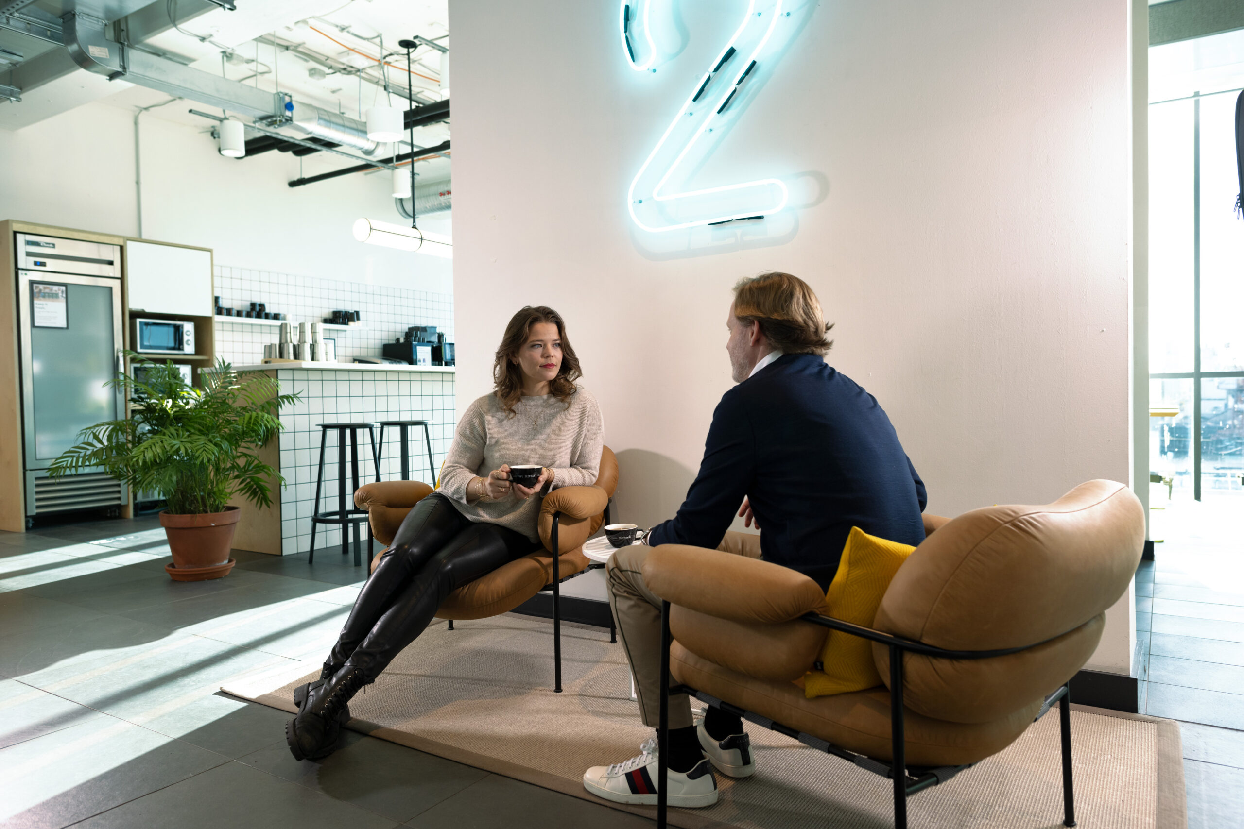
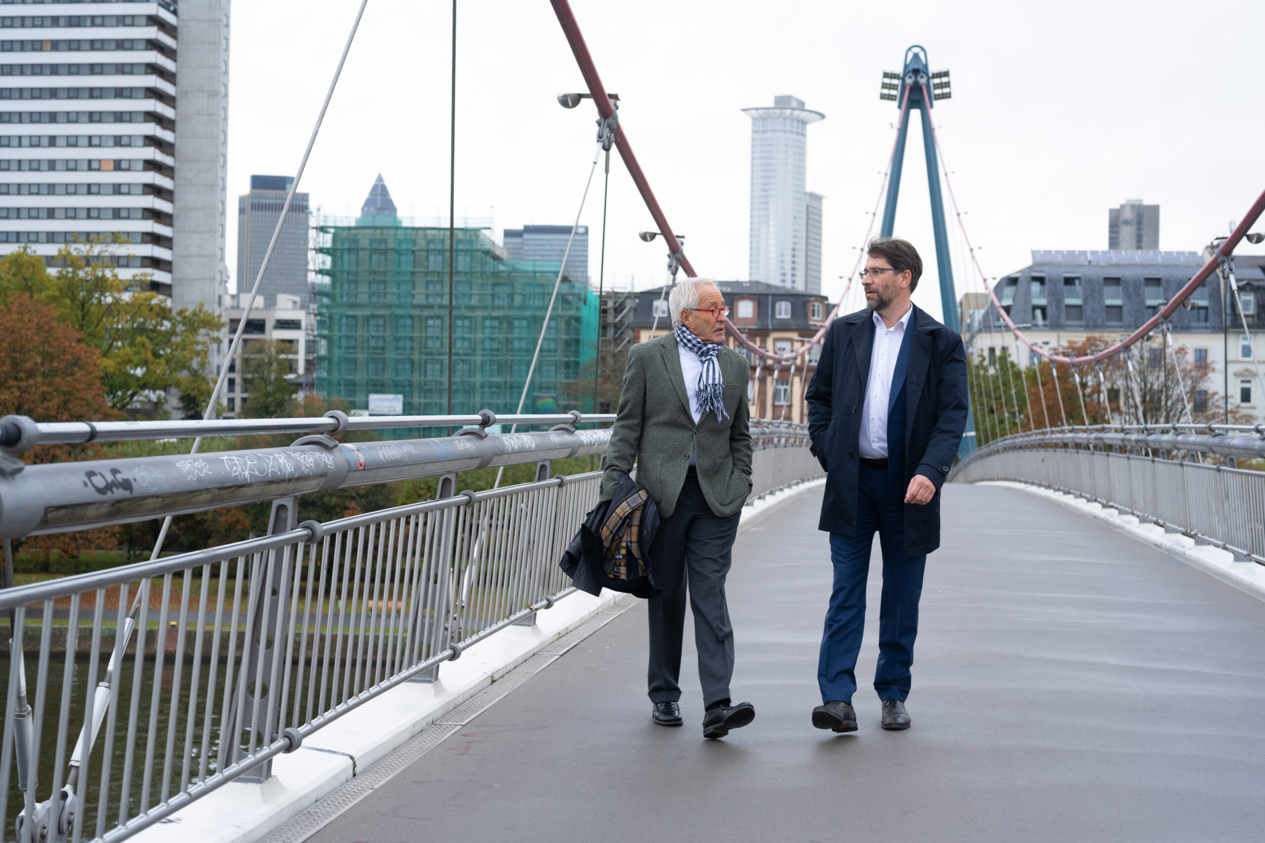
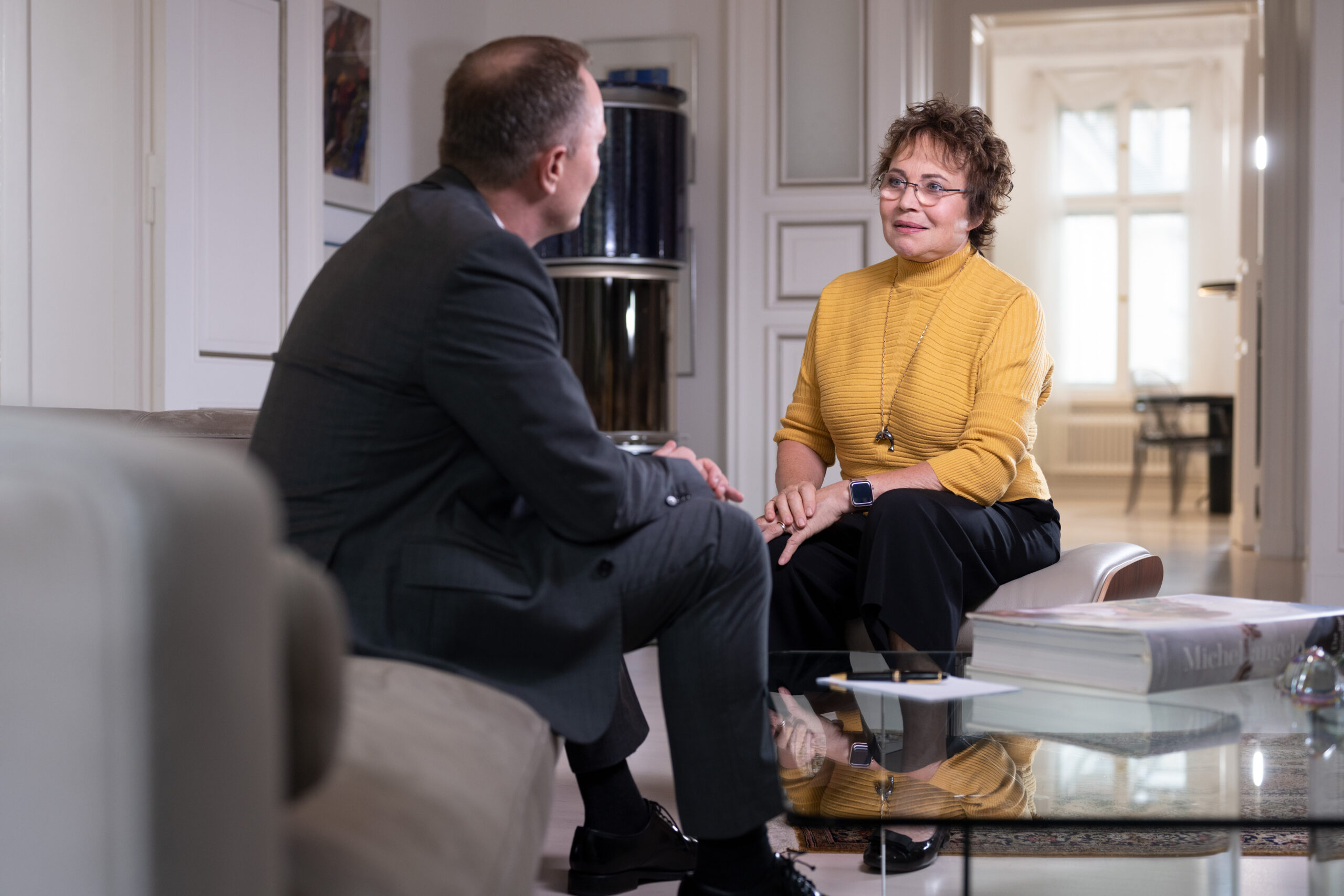
At Hansen & Heinrich, dialogue is of crucial importance – not only internally, but also in relation to the client. The brand sees itself as an equal Partner who manages client's wealth together by consensus – with plenty of technical expertise, but not from above. This core idea is represented by the "&" in logo and throught other assets. The small orange arrow, integrated into the logo, represents growth and future orientation.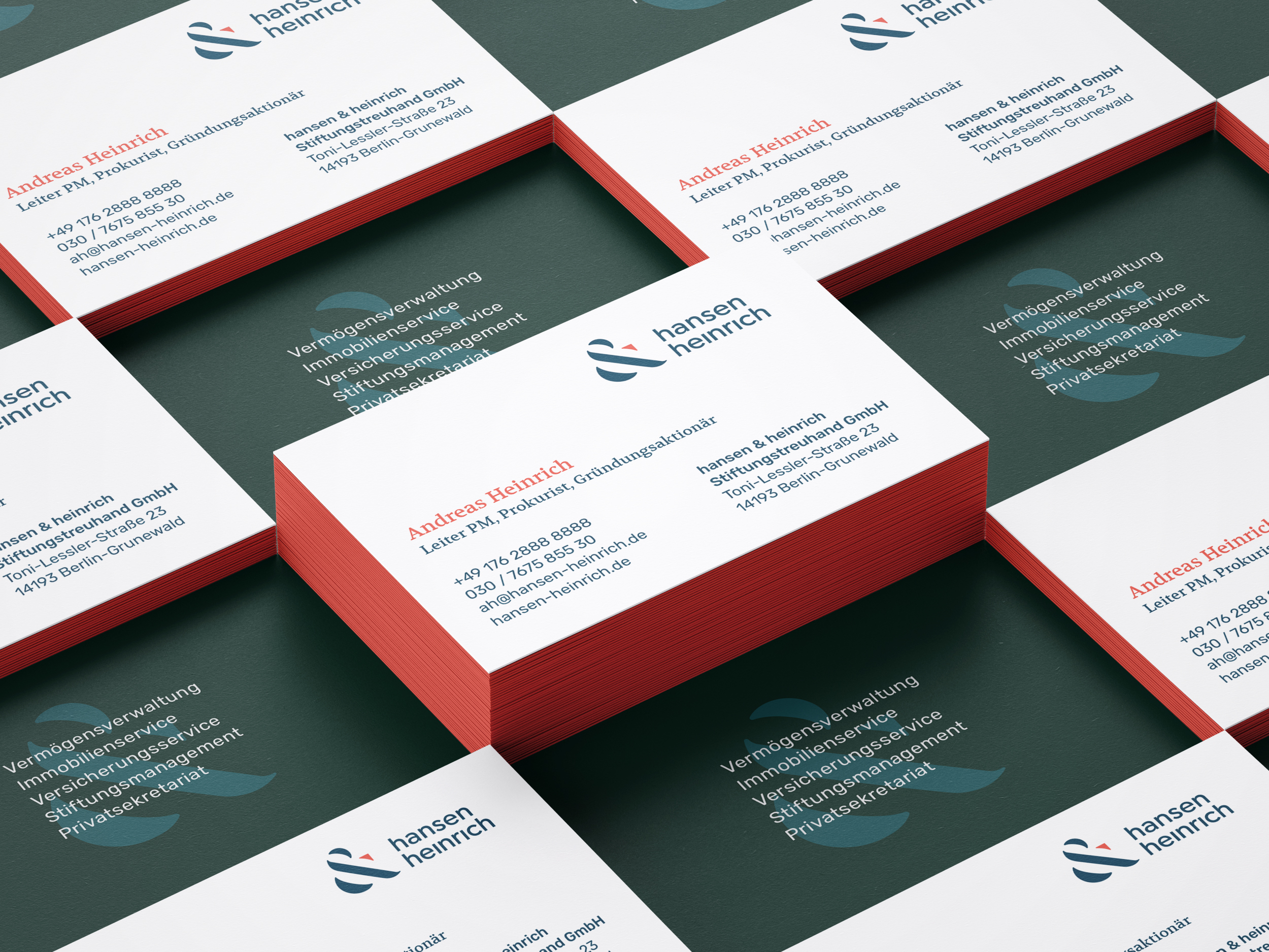
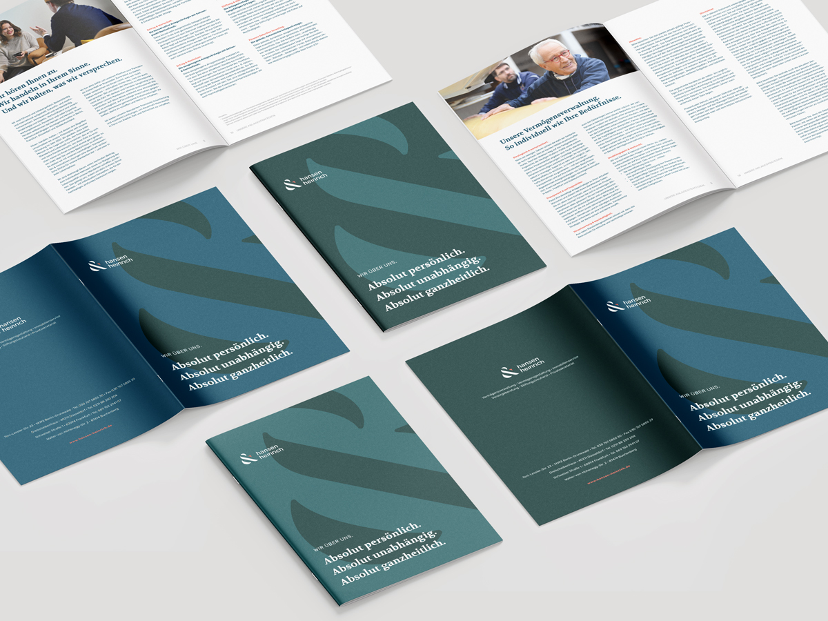
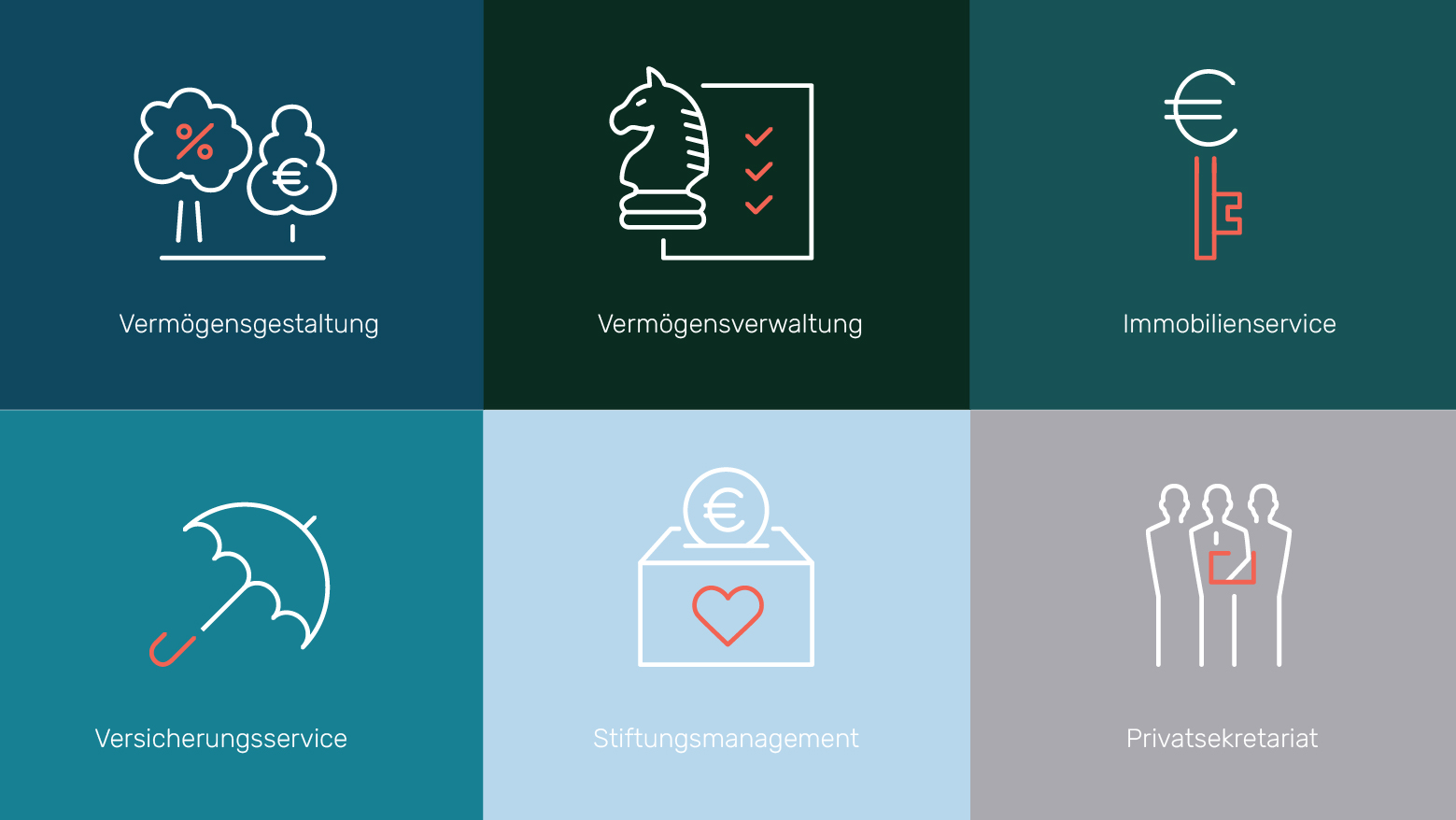
Hansen & Heinrich has a rich color palette – as externsive as the range of its services. The dominating dark, earthy colours represent values such as trustworthiness, knowledge, heritage. Bold red-orange, which stands for innovation and modernnes, is used to highlight small but important details.
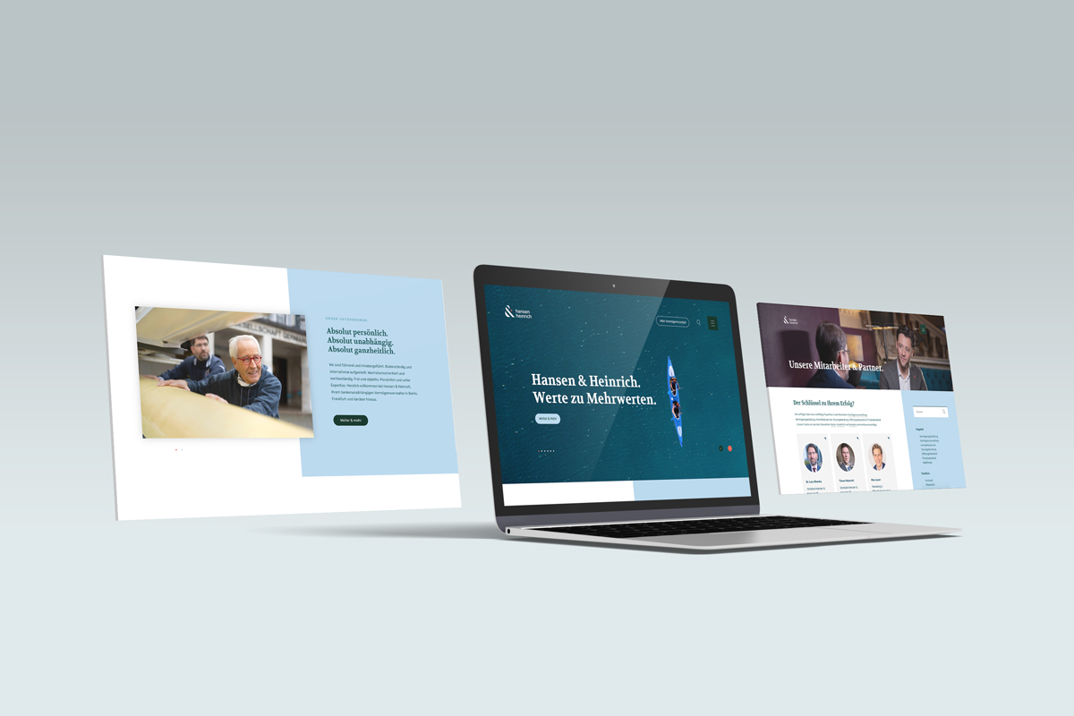
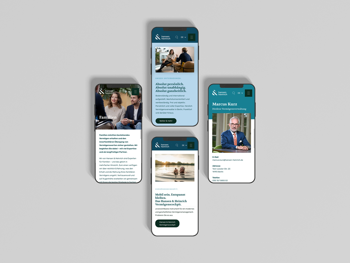
hansen-heinrich.de is a newly designed company's corporate website, where clients can check out company's offers and profiles of wealth managers.
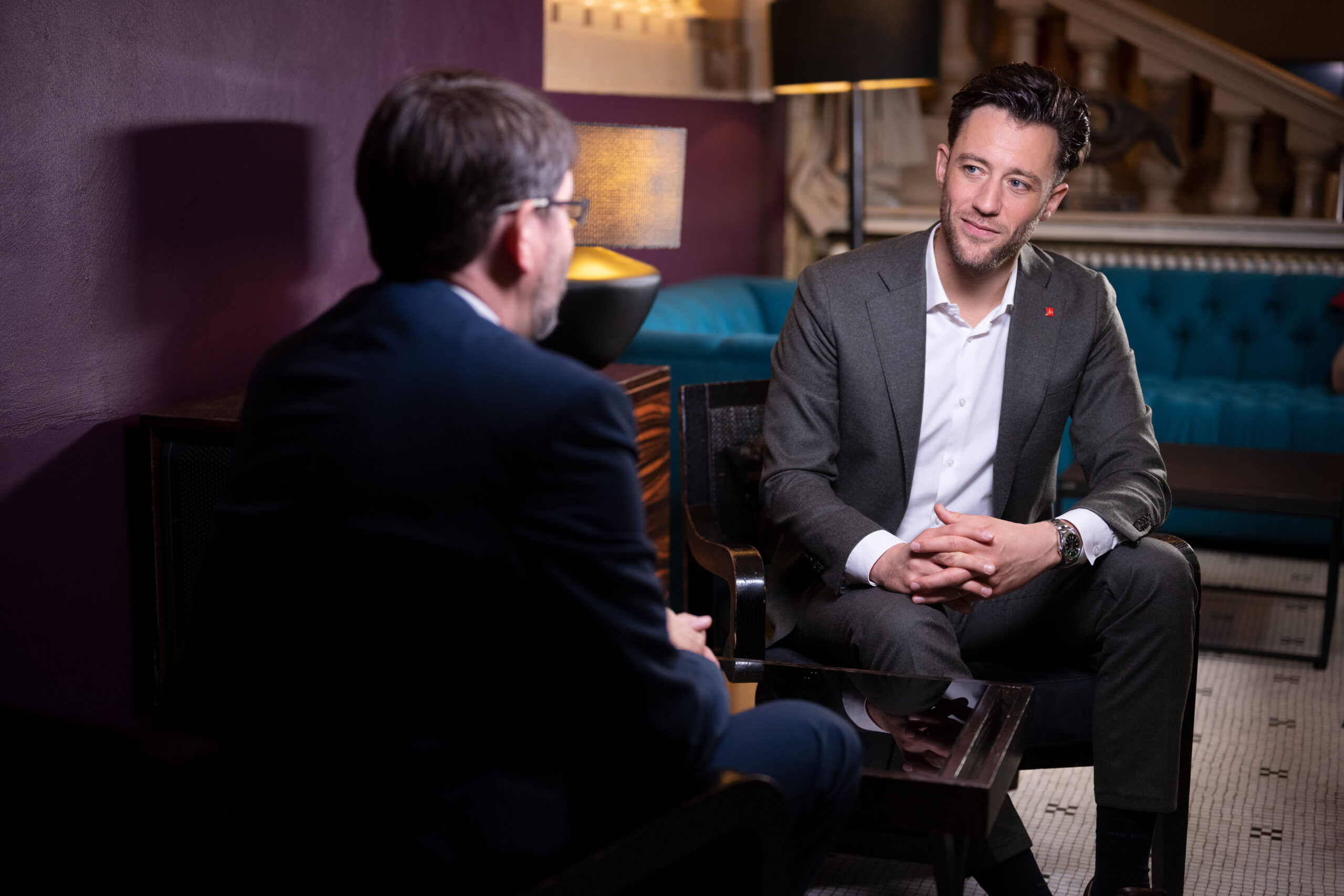
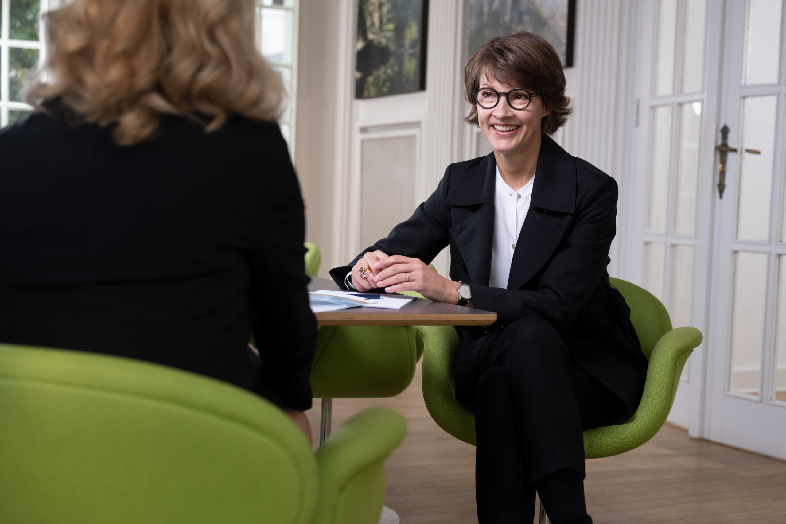
To express the "&" concept in corporate imagery, a photoshoot featuring wealth managers and their clients was organised. There is always a live dialogue in the frame, with the emphasis on the client and his/her universe.

Credits: Eugenia Kubas (Art Direction, Graphic Design, UX/UI), Sacha Moser (Creative Director), Marco Laux (Web-Developer), Alex Sistenish (Copywriter), Markus Neumann (Account Director), Run Zebra Run (Graphic Design), Urban Rutz (photography).